


Streamlining Data Load and Reporting Operations for Unilever.
Enterprise
FMCG
Research heavy
Complete UI/UX Rehaul

Role
UI/UX Designer (End to end)
Researcher
Timeline
16 Weeks
Jul 2024 - Oct 2024
Team
1 Designer (Myself),
5 developers, 1 PO, 1 Architect
Skills
User experience, Research, User interviews, Concepts, Interaction design, UX Strategy
Tools





Context
What was it about?
What is the project about?
This project focused on redesigning the platform to support complete reporting workflows within a single, unified experience.
What is PMRS
Performance Management Reporting System is a 10 year old reporting platform which helps users to load raw data and generate insights in the form of reports which helps executive people to take business decisions accordingly.
How it works

Why - The problem
The Old Experience Was No Longer Enough
As reporting needs grew more complex and business expectations increased, the cost of errors became higher. Especially during peak business cycles, the old experience started visibly breaking down
Symptom 01
35-45%
Longer reporting turnaround time during peak reporting cycles
Symptom 02
65%
of support tickets tied directly to UX issues
The cost
Business was directly impacted. The system's inefficiency had become a strategic liability.
What we assumed going in
We thought fixing the UI would fix the problem

We initially believed that modernising the look and feel and reducing visual clutter through a redesigned experience would be enough to make the system work as intended.
What I decided?
I chose to validate before we design anything, so we decided to conduct a heuristics analysis first and followed by that mixed methods user research study.
Why directly interviews & surveys - not usability testing?
The system was over 10 years old and heavily adapted. Evaluating the workflows alone wasn't the goal, a heuristic evaluation can cover that. The real unknown was why users faced delays, what workarounds they had developed, and what they actually needed. That's why I prioritized interviews and surveys.
Usability testing
Would primarily validate the interface issues already identified through heuristic evaluation without uncovering the reasons behind users' workarounds or unmet needs.
Mixed methods (Interviews+ Surveys)
Reveal real-world usage under pressure, what success means to users, and where the system breaks trust.
Research - The turning point
We did a layered research approach to find the real problem
Step 1
Heuristics Evaluation
Since the application was already live, I began with a heuristic evaluation. Walking through the core workflows helped me quickly identify usability issues and areas of user friction.
The Goal
To build a baseline understanding of the system's flows and surface usability gaps before speaking to a single user.
Step 2
User Interviews
I interviewed users from the Data Load and Report Generation teams in India. Although the product serves a global audience, India has the largest user base, making it the primary focus for gathering insights.
The Goal
To uncover how users built workarounds and what the system failed to support
Step 3
Questionnaire Surveys
The survey was designed using insights from the interviews to validate and measure the most common user problems at scale.
The Goal
To Measure Prevalence & to validate patterns


Key Insights
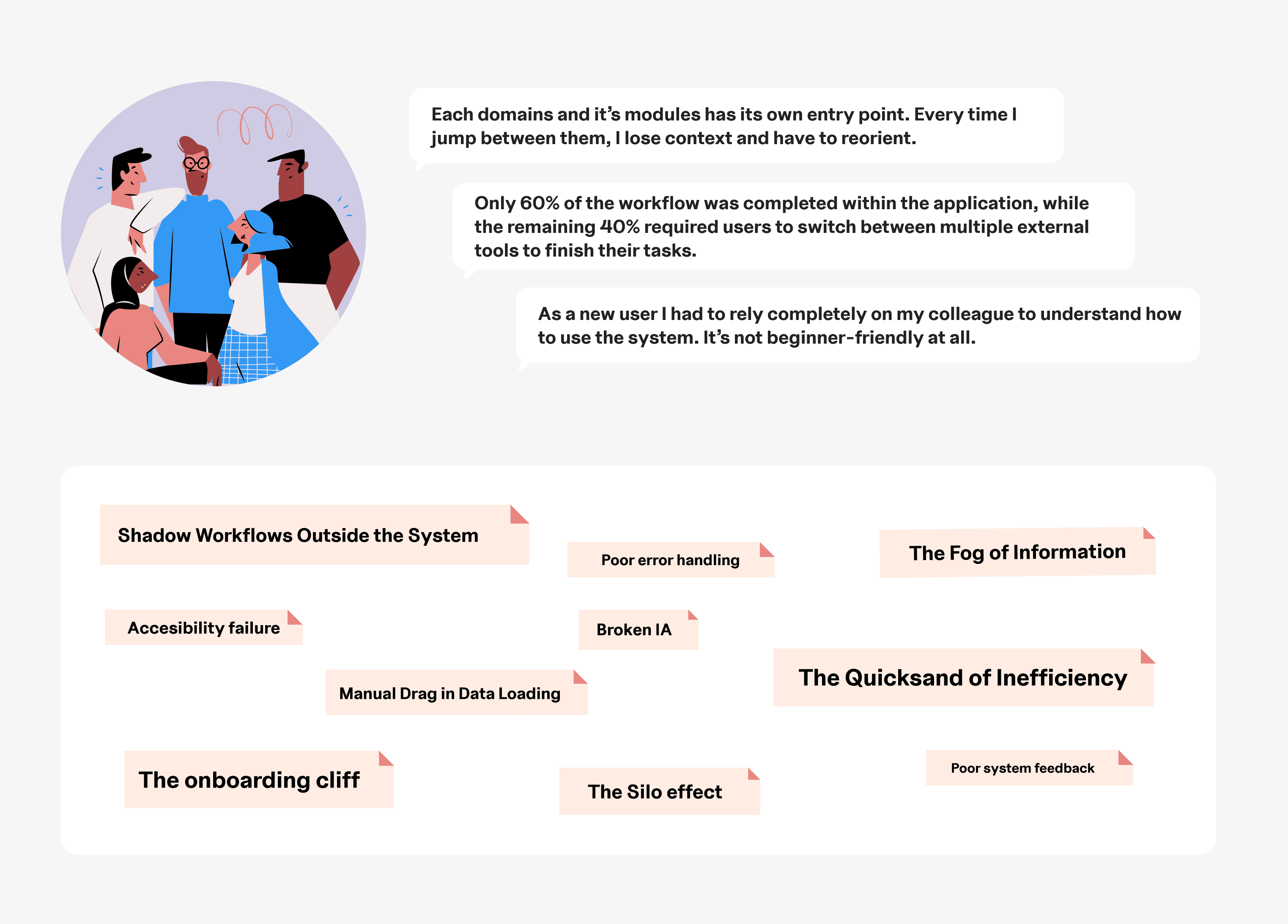
The biggest takeaway was System structure ≠ User mental model

Design goal
From fixing the system structure to unifying the experience with trust
I facilitated the research synthesis workshop with product and engineering team to define the right solution for this release

Focus 01
Structure the system around tasks, not domains
Organize every screen around what users are trying to do, not how the backend is structured. Domains become invisible the user sees their goal, not our architecture.
Focus 02
Build trust within the system
Increase users' confidence by making system status, data, and outcomes visible throughout the workflow. Provide previews before export, traceability for data loads, and contextual guidance for onboarding reducing reliance on Excel, email, and manual verification.
Focus 03
Unified experience
Make every export or data-load workflow completable in one continuous flow, no jumping between other applications, no holding context in your head, no re-entering the same parameters.
Key decisions
Strategic decisions & Trade-offs
What we did?
We intentionally deferred high-complexity features to protect delivery speed while solving the highest-value problems first.
How we used effort Matrix: Not as a ranking tool, as a shared alignment tool for the whole team.
The PO, developers, and stakeholders all contributed to placing features on the matrix. This meant every trade-off was visible and agreed on, not made silently by the designer or the PO alone.

Trade-offs: Delivery speed > Complexity
Delivering value incrementally by deferring high-complexity features to future phases.
Trade-off 1
Deferred
Load data directly from sharepoint

The design intent
We explored integrating direct data pulls from SharePoint in addition manual uploads.
Constraint
The approach required significant security, authentication, and backend dependencies.
The Decision
To protect timelines and system stability, we deferred this and prioritized the core Data Extract & manual load capability.
Trade-off 2
Deferred
In-App task Management

The design intent
We proposed moving data load and report generation requests from email into PMRS with in-app notifications.
Constraint
Although it improved visibility and speed, it added more development effort and added complexity for the first release.
The Decision
To keep the launch focused and reliable, this enhancement was planned for a future phase.
Key Iteration
Iterating on how should reports and booklets be structured?

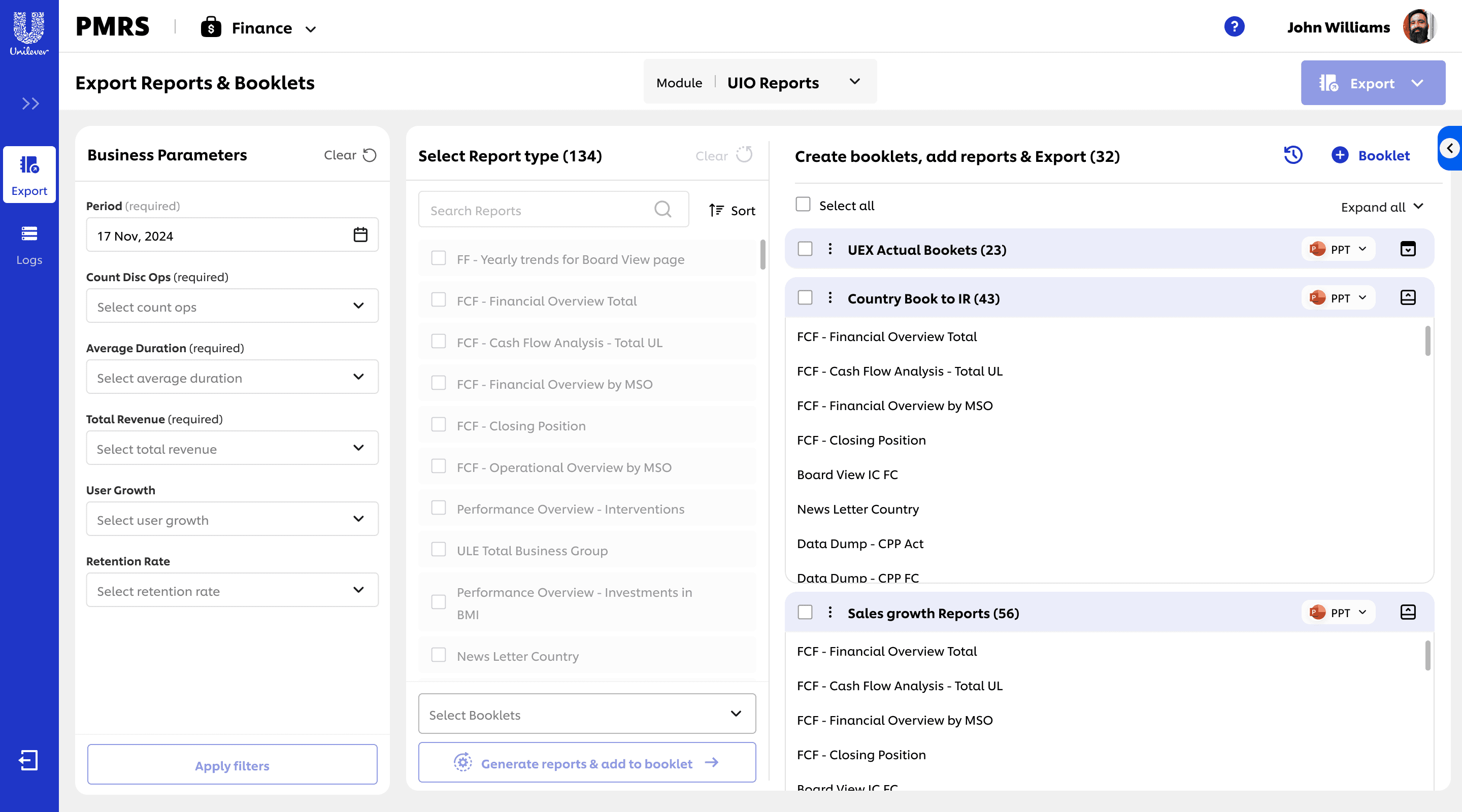
Rejected
Option A - Different Pages
Access reports and booklets from different pages.
Approved
Option B - Single Unified Page
All reports extraction in one view.
Why we chose option B ?
Booklets export were introduces as part of the solution and splitting reports and booklets accross pages would have forced unnecessary navigation, repeated inputs, and mental effort just to complete one export.
Solution
The new experience
01 - Navigation

Insight
Each domain has its own entry point. Every time I jump between them, I lose context and have to re-orient.
85% reported they will have to switch to multiple links to complete export/load operations for one domain.
Designed around what users do, not how systems are organised
Instead of organizing content by domain or module, I focused on functional intent, grouping screens and actions based on tasks. Followed a noun + verb approach using nouns for navigations to clearly define sections, and verbs for actions to guide users on what they can do
Impact → This shift improved discoverability, efficiency and reduced navigation effort following a logical goal centred flow.

02 - Onboarding
Insight
As a new user I had to rely completely on my colleague to understand how to use the system. It’s not beginner-friendly at all.
80% of users found the system difficult to understand during onboarding
Reduced onboarding friction
A guided product tour was introduced to onboard new users by walking them through key tasks . The tour highlights essential actions and explains system behavior in context, reducing reliance on external documentation or training.
Impact → Shortened onboarding, helped users become productive faster.

03- Export
Insight
I usually export multiple reports and merge them outside PMRS. It doesn’t really support pulling everything together in one go.
95 % of users were not completing their tasks within this tool.
One space. Multiple export needs satisfied.
A new booklet-based export experience lets users group multiple reports into a single downloadable package, making bulk exports faster and more organized. Both single report exports and booklet exports are handled within the same interface.
Impact → Reduced the need to work outside the system, one interface for all exports

04- Report Preview
Insight
Exporting feels like guessing. Without a preview, I have to double-check everything outside the system.
90% experienced errors discovered only after export
Seeing before sharing, report preview.
Introduced a Report Preview feature that lets users view content, verify details, and download the previewed report as a single file.
Impact → Improved clarity and accuracy, reduced rework and made exporting the right reports faster.

05 - Data Load
Insight
Loading data is where everything slows down. Pulling from source systems means waiting on someone else, and loading manually means too many steps with no way to know if I did it right.
80% found data loading time-consuming and error-prone
Introduced simplified and flexible data ingestion
Users can now load data directly from available data sources within PMRS, removing the need for manual handoffs and extra steps.
Impact → Reduced manual effort, minimized errors, made the system significantly faster and reliable

Streamlined the manual data loading workflow.
Manual uploads were retained but improved with a predefined template, a quick upload guide, and a history log showing recent uploads for traceability.
Impact → Less manual effort, fewer errors, full traceability

06- Log history
Insight
Can't trace data loads older than 30 days. When a load fails, there's no visibility into what happened or when.
68% discovered failed loads only after downstream reports were affected. And found it difficult to trace the status or history of their load and extract operations.
Every action accounted for
A unified log history brings all data load and report extraction extraction activity into one view who ran what, when it started and ended, and it's current status. Instead of asking around or blindly re-running jobs, users can trace any operation, spot failures early, and confirm completion without leaving PMRS.
Impact → Improved faster failure diagnosis, complete operational visibility.


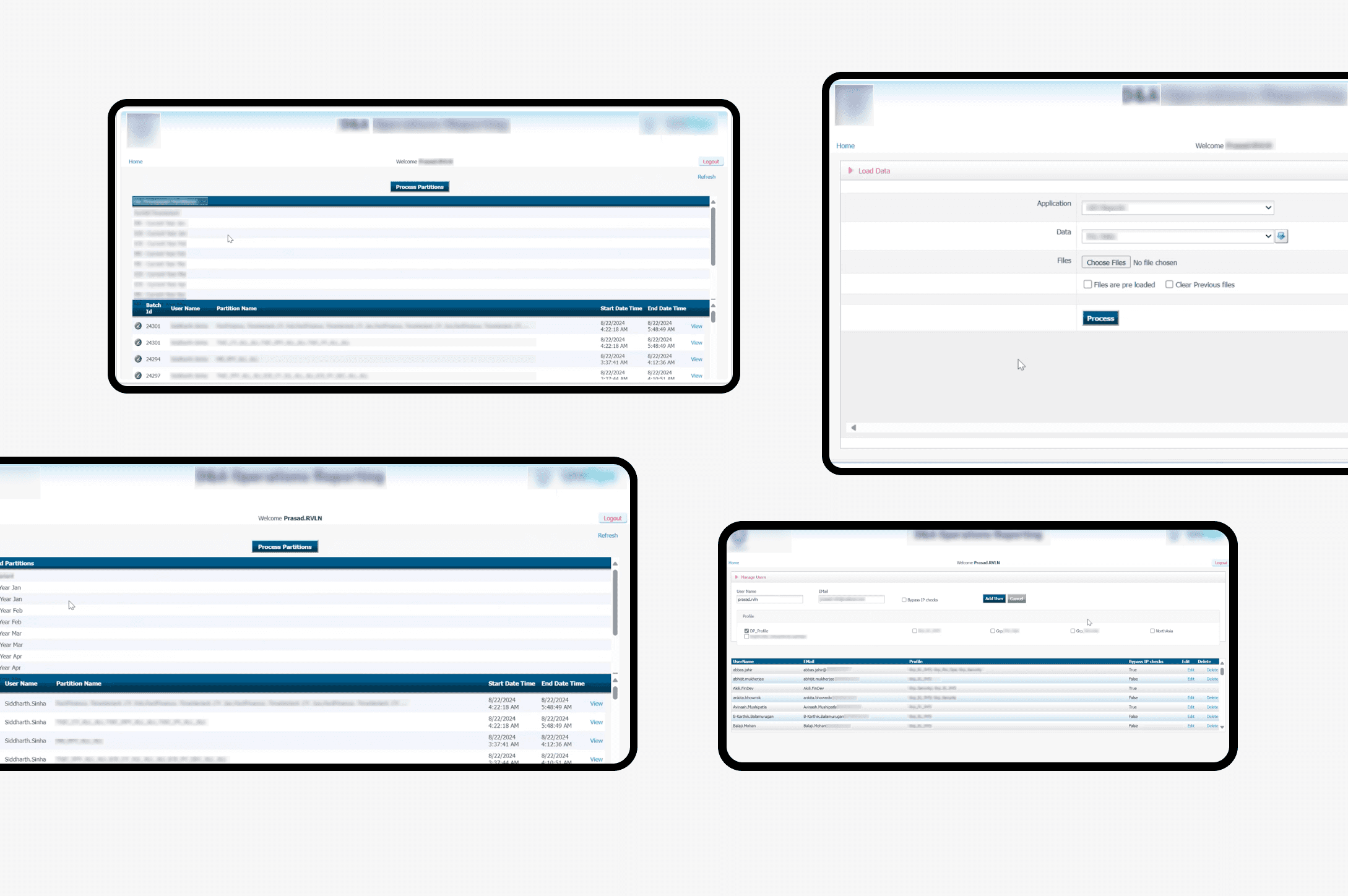
Before
Hard to learn
Onboarding relied heavily on peer support and trial-and-error.
Fragmented navigation
Users had to jump across modules to complete one reporting task.
Low confidence during tasks
limited clarity and feedback increased hesitation and repeated actions.
High manual effort
Users spent time compensating for the system rather than focusing on reporting outcomes.
Workarounds were normalized
Users adapted their behavior to make the system “work”
Accessibility as an afterthought
Low contrast, dense layouts, unlabelled controls making difficult for users.
Silent system
Actions gave little or no confirmation
Dead end errors
Failures surfaced as cryptic messages or not at all.

After
Faster onboarding
Users could understand the workflow and become productive sooner
Task-driven flows
Reporting journeys were more continuous and easier to follow end-to-end
Improved clarity and trust
users received better visibility and feedback while completing tasks
Reduced rework
Fewer repeated actions caused by uncertainty
Less dependency on workarounds
Users could complete workflows with fewer manual compensations
Inclusive by design
Improved conrast, clear labels, proper form field labels, proper links and buttons, tooltips, indicating required fields etc.
The system talks back
Every action gets a response
Errors that explain themselves
Error states now say what happened, why and what to do next.
Impact
What actually changed
Measured faster task completion
Measured across 32 representative export tasks before/after redesign.
of human efforts saved annually
Modeled across 1400+ users
Improved productivity
Measured in report generation throughput for core workflows.
Behaviour changes - the part that proved it worked
📈 New users got productive without a colleague.
📉 The workarounds shrank.
📈 Exports stopped being a guessing game.
📉 Data loading stopped being the bottleneck
What it means?
The shift from a domain-based structure to task-driven workflows didn't just make the system faster, it made the interface match how people already thought about their work. The friction we opened with wasn't a UI problem. Solving it wasn't a UI fix.
Reflections from the journey
Validating cost us two weeks, and saved the release
Pushing back on "just fix the UI" to invest time in research felt risky within a 14-week timeline. But had we designed around the original assumption, we'd likely have shipped a cleaner interface without addressing the underlying workflow problems. The slower start gave us the clarity to build the right solution.
Trade-offs made in the open don't come back as conflict.
Deferring SharePoint integration and in-app tasks could easily have become points of friction later. They didn't because we used the effort matrix together to define the priorities. Nothing was parked silently by me alone, so nothing needed to be re-litigated. That's the part of this project I've carried into every one since.
Final Thoughts
This project reminded me that great design is not just about improving usability, but also about collaborating efficiently and making strategic decisions under constraints to deliver impactful results.
Thanks for reading my case study!
If you have any more questions or want to know more details, please don't hesitate to contact me. For now, please consider checking my other work, my experiments, or learn more about me.
Next case studies


AI Network Optimizer
Designed an AI-powered logistics planning tool to unlock cost efficiency across India’s supply chain for Unilever.
Enterprise
Logistics
AI
FMCG
0->1
